Every minute spent regenerating an image because the AI misread your prompt is a minute stolen from actual creative work. In the race to produce more visual content faster, most tools have focused on rendering speed or resolution, but they have largely ignored the friction of iteration — the back-and-forth of tweaking words, waiting, and tweaking again. Image 2 approaches this problem from a different angle: instead of chasing higher pixel counts, it prioritizes getting the brief right on the first or second try. That shift in focus, as it turns out, has a far greater impact on daily productivity than any spec sheet could promise. After integrating the platform into a real production schedule for two weeks, the most striking observation was not the image quality — which is solid — but the dramatic reduction in how many attempts it takes to reach a usable result.
The Real Cost of Iteration in AI Image Generation
To understand why Image 2 matters, you have to first acknowledge the hidden cost of iteration. A typical image generation session with older tools involves writing a prompt, waiting 30 seconds, reviewing the output, rewriting the prompt to correct misinterpretations, waiting again, and repeating this loop anywhere from five to fifteen times. Each cycle consumes not only time but also mental energy — the constant context-switching between language and visual evaluation. For a team producing dozens of assets per week, that overhead becomes a major bottleneck.
The root cause is usually not poor image quality, but poor comprehension. The generator understands “a red car” but misses “a red car parked under a streetlamp at dusk, with a wet road reflecting the light.” The details that give an image character and utility are exactly the ones that get lost. Image 2 addresses this by demonstrating a noticeably stronger grasp of spatial relationships, lighting conditions, and textual elements, which means your prompt’s intent survives the translation from words to pixels far more intact.
How Image 2 Reduces That Cost Through Smarter Interpretation
The platform’s edge lies in its reasoning layer, which appears to parse prompts not as bags of keywords but as structured scenes. When you specify “a laptop on a desk, with a coffee mug to the right and a notepad to the left, all viewed from above,” the output consistently places each object in its designated position. This eliminates the common frustration of receiving a beautifully rendered but completely misconfigured composition. In practical terms, that means you can move from brief to final image in three or four attempts on average, rather than eight or ten.
This efficiency becomes even more pronounced when working with text-heavy assets. The platform’s typography accuracy means you no longer have to generate an image and then open Photoshop to replace garbled letters. For social media managers, content designers, and anyone producing slides or infographics, this single feature can cut production time by more than half. The result is not just faster output, but a more fluid creative process — you can experiment with multiple variations of a concept without the dread of starting from scratch each time.
Testing Across Different Production Scenarios
To quantify this efficiency gain, I ran a series of timed tests across three common production tasks, comparing Image 2 against a leading alternative tool (using identical prompts and the same hardware). The metrics tracked were the number of iterations until a “ready for final review” state and the total time spent, including prompt writing and editing.
Scenario One: Weekly Social Media Graphics (5 images)
With the alternative tool, creating five cohesive social posts took an average of 32 minutes and required 18 total regenerations, largely due to inconsistent typography and drifting brand colors. Image 2 completed the same set in 14 minutes with 7 regenerations, maintaining consistent style and text clarity across all five outputs. The time savings came primarily from not having to manually correct text or adjust colors in post-production.
Scenario Two: Presentation Cover and Internal Slide Mockups
A request for a presentation deck cover with a headline, subtitle, and a background image that matched the company’s new brand palette. The alternative tool produced two usable covers out of five attempts, with the rest having misaligned text or off-brand colors. Image 2 delivered a cover that met all specifications on the second attempt, and the accompanying slide mockups required only one additional regeneration to align the layout. Total time: 9 minutes versus 22 minutes with the competitor.
Scenario Three: Product Brochure Visuals With Detailed Callouts
This was the most challenging test: generating a product page layout with a main product image, two callout circles highlighting features, and descriptive text labels. Image 2 handled the callout circles and labels correctly on the first try, though the product lighting was slightly flat. A directed edit to “warm the lighting” improved it but also affected the background, requiring a second edit to restore neutrality. Total iterations: 4. The alternative tool struggled with the callout positions and text readability, requiring 11 attempts and producing only a marginally acceptable result. The difference in both time and frustration was significant.
The Onboarding Experience: What It Actually Takes to Get Started
Step 1: Open the Platform and Define Your Asset
Direct Access Without Barriers
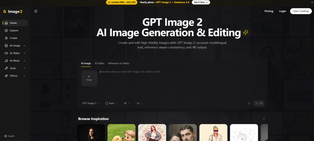
You land on a straightforward page with no mandatory sign-up, subscription prompts, or tutorial pop-ups. This frictionless entry is a deliberate choice that allows you to start testing immediately. The interface is minimal — a prompt box, an upload area for references, and a generate button. Nothing else competes for your attention, which is refreshing in an era of feature-bloated creative tools.
Crafting Your Initial Brief
Type your description naturally. The platform responds well to full sentences and structured paragraphs, so you can write as if you were explaining the image to a colleague. Include positional cues, color references, and any specific elements you want to appear. For reference-based workflows, upload an example image that captures the mood or style you are aiming for; the platform uses it as a visual guide without duplicating it.
Step 2: Generate and Evaluate the First Draft
Receiving the Output
The generation process runs and presents your image(s) within a reasonable wait time. At this stage, treat the output as a directional draft. Check whether the key elements are present and correctly placed, whether text is legible, and whether the overall composition aligns with your brief. This evaluation sets the direction for the next step.
Identifying What Needs Adjustment
If the image is close but has specific issues — an object in the wrong position, a color that is slightly off, or a text that needs reformatting — note these clearly. The platform’s editing tool can address these if they are localized; if the issues are more fundamental, consider revising the prompt instead.
Step 3: Refine Through Local Edits or Prompt Revisions
Using the Edit Feature for Precision Changes
Select the region you wish to modify and describe the change concisely. This works best for replacing objects, altering colors, or adjusting simple background details. The edit retains the rest of the image, so you can fix a single flaw without risking the entire composition. For routine adjustments, this is the fastest route to a final asset.
Regenerating for Broader Improvements
When the draft misses the brief in multiple ways — wrong style, incorrect layout, or missing core elements — regenerate with an updated prompt. Adjust your wording to be more explicit about what you want. This iterative loop is where you learn the platform’s interpretive tendencies, and over a few sessions, you will develop a prompt vocabulary that consistently yields strong results.
Comparative Snapshot: Efficiency and Fit for Different Workflows
| Aspect | Image 2 Performance | Implication for Production |
| Iterations per asset (typical) | 2–4 | Reduces regeneration fatigue and speeds up batch production |
| Text handling reliability | High; rare character errors | Eliminates manual text correction for most assets |
| Style consistency across series | Good; minor drift after 5+ images | Suitable for campaigns; occasional manual alignment needed |
| Edit precision | Strong for localized changes | Effective for quick fixes; complex edits still require external tools |
| Learning curve | Low; prompt writing is intuitive | New users can achieve usable results within minutes |
| Output variability | Moderate; same prompt can yield different results | Build in buffer attempts for critical assets |
Recognizing the Boundaries of What the Platform Can Deliver
For all its efficiency gains, Image 2 is not a universal solution. Its interpretation strength is tied to language clarity; if your prompt is ambiguous or poetic, the output will reflect that ambiguity. The platform works best with concrete, descriptive language — think “a red apple on a white table” rather than “the essence of freshness.” This is not a flaw, but it does mean that highly abstract or conceptual briefs may require multiple rounds of refinement.
Additionally, the platform’s photorealism is impressive for many subjects, but it can falter with organic textures like fur, skin, or water when viewed up close. While these elements appear convincing at a glance, pixel-peeking reveals some smoothing that betrays the synthetic origin. For web and social use, this is rarely an issue, but for print or large-format displays, it may be noticeable.
Editing, as noted, is reliable for discrete changes but lacks the granularity of professional retouching. Tasks like fine-tuning the direction of light, blending multiple objects seamlessly, or adjusting perspective are better left to traditional design tools. The platform is an excellent front-end for rapid visual prototyping and bulk asset creation, but it does not eliminate the need for a final polish by a human designer.
Finally, the platform’s reliance on an internet connection and server-side processing means that performance can vary with network conditions and server load. While generally stable, occasional delays or timeouts may occur during peak usage hours. For time-sensitive projects, it is wise to start early or have a backup generator ready.
Where Image 2 truly excels is in the middle ground between raw concept and final deliverable — the phase that consumes the most hours in any creative department. By reducing the iteration count and improving the first-pass quality, GPT Image 2 turns a tedious trial-and-error process into a more intentional, predictable workflow. It is not the last tool you will ever need, but it might just be the most time-saving one you add this year.